Pages

Friday, July 27, 2012

More Photo's from my Embroiderer's Ledger


 I have shown this page before. I just wanted to show that I have added my FME practice piece to represent lace. This is done on tissue paper. Then on top of that I have added some lace motifs of a flower & two dragonflies.

On the page beside it I have FME some dragonflies onto tussue the cut them out & added them to the page.

I have done this to show continuity of workings from my original dragonfly design.
 This is the back of the previous page. I have added anothe photo of the original piece that I used for this project.

I have then taken elements from this piece & done some sketches for later projects.
 This is a close up of the sketches, from the above photo
 These next two photos are just a few more of the sketches that I have done from the main design.
The photo below shows how I have taken the sketch above further. I have worked it more in colour & stitch. The scroll & three of the petals on the flower are cut out to reveal the original design behind. I have then stitch around the scroll in gold thread & added a few extra scrolls. I have also added some web stitches to the page as well.

The edge of the page is a tissue paper lace that I made with FME. I have done it onto the edges of the page as well. I have then added a cut out dragonfly that has had the cenral wing cut so that it sits of the page, & I have added some clear dimensions paint to make it shinny.

 The photo below is another page that I have all ready shown. But have also added to. Well, taken away in this case. Behind this page is some fabric that I made by FME onto silk organza. I love the fabric & felt it was not being shown to its potential, being hidden by the top page. So I have cut out another wing on the page to act as a window to the page beyond.
 This is my emulsion painted page. I have stamped a lace design onto the emulsion using Stampin up felt pens onto a chantilly lace stamp that I have. The results where not quite as clear as I would have liked. The section at the bottom is more emulsion. But this time I have used water colour paints to draw my lace design. The emulsion had sections of resist in it, which has resulted in the paint beading. But patience has let the paint dry & it looks destressed.
 This picture below shows what the stamp looks like when stamped onto cartridge paper.
 This emulsion painting has the design stamped onto it using acrylic paints & an Indian wood block. I much prefer this one to the one before.
 In this photo I have grouped together all of my tissue paper & FME samples. I could not decide where I wanted to put them. So I added them all together as a group of samples.

This photo is of the page in which we added embroidered inserts to the page. Along with emulsion paints & embroidery direct onto the page. I am very pleased with this page.
I have been having so much fun doing this workshop with Karen Ruane. I am sad that it has ended. But at least I still have access to her if I need it in the future & I can still get inspiration from the groups flickr page. Plus I will be taking Karen's next workshop. Extended embellishments. So I will add what I learn in that class into this book as well. Plus there are still a few things that I need to do from this class. So you have not seen the last of my work yet :-) Until next time.

Warm Hugs
Your Friend
Elizabeth xxx

Monday, July 16, 2012

A deviation In my journey

 After doing the dragonfly designs shown on the previous post. I thought of some work that I had done in a previous workshop, called "50 Drawings," In this workshop I looked at a piece of embroidery owned by the UK embroiderer's guild. And in particular the dragonfly within this piece.


I have added the booklet to the embroiderer's ledger book, as a design source, but also as a link to what will come next. On the right hand side of the photo I have added a piece of mono print that I did in the workshop. Then over the top of that I added a clear sleeve & added a piece of embroidery I did for my City & guilds homework. Again a dragonfly, but it is different from my original concept, I know.
 In this photo it shows a glimps inside the booklet & the relationship of the dragonflies.
 This photo is a close up of the embroidery & the mono printing done on grease proof paper. Both of these can be lifted to reveal what may lay beneath.
 In this photo it shows the conection with the dragonfly booklet & the exercise we had to do for week 3 part 2. And that was to take an image & take a section of it & look at the shapes. Then first paint in water colour or ink, then in pencil.
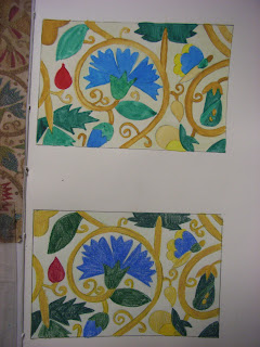
 Though not an exact replica, I am quite chuffed with the results. The top picture is the water colour painting. Done with Windsor & Newton water colour paints. Then the bottom picture is done in water colour pencils by Derwent.
 These two photos show the same fabric swatch exercise that I did for the paintings. One was done in normal flurecent light, the other I used a flash. The fabric samples are taken from the colours & shapes used in the paintings.

This photo shows the full layout of the week three exercise.


Even though I did deviate a little on my journey through this class. There is a sence of continuity through out. Flora & Fauna.

Till my next post cheers
Warm Hugs
Your Friend
Elizabeth xxx

Sunday, July 15, 2012

Extensions of work

 This photo shows my first attempt at hand patchworking. I have stitched the hexagon patchwork on to the piece of FME done on the quilters Muslin. Then I sewed the two pieces onto the tissue paper piece that I did earlier in the class.
 This is a close up of the patchwork
 This photo show the pice in situe now in the book.
 Here is the further workings on the dragonfly piece that I did earlier as well. I put another page over the top of the dragonfly design then cut out a window, & made a door to go over the top of it. Something to entice the reader to look behind.
 On this page I added the FME piece of silk organza, as it resembled the wings of a dragonfly
Sorry this photo is sideways. I could not get the photo to up load the right way around. I have printed a lace design onto some vellum/parchment. This shows a sneek peek into what is behind.

Warm Hugs
Your Friend
Elizabeth xx

Monday, July 9, 2012

We are now up to week two lesson two

I have done so much since my last post I don't know where to start. I guess I should start where I left off I guess.
 In this photo I have taken the breif given to us & used a transfer design supplied by Karen the teacher. I have modified it a bit to be my own design though. We had to section off a part of the design & colour it using only one colour. I have used a cherry cobbler (Stampin Up felt tip pen)
 On the next section of the lesson we took the original transfer & used it to back some cut outs on the next page. I have modified it again to be my own design. I have also extended the design out side of the cut out shapes. I have also taken the design & using sections of it, drawn it on to hexagons shapes to represent a quilt.
 I have further embellished this page by added some FME flowers & leaves, to show how they could work with this design.
 This page is completely different. I was at first going to do a dragonfly design, but did the flower one instead. I will how ever work this dragonfly design further. The inspiration for this design was from a magnet on my fridge. I drew it then played around with the sizings 0n the printer.
 Here I have decided to add another page over the top of this design. I wanted to create it as a window into the next page, making the reader want to know more. Around the edge of the circle cut out shape I have done needle lacing. The page was attached my tying it to the other page
 This is a piece of FME done onto some quilters muslin, A close woven sort of scrim. It has got a bit more work to be done to it yet before it is finished. I am going to added some quilted Hexagons & some hand embroidery.
 This piece of FME (Free machine embroidery) was done onto some silk organza, that was kindly given to me in a pack of other silk fabric, by a dear friend Isabell. I love how this looks like a series of spider webs.
 This is where week two lesson two starts. We had to collage layers of tissue paper together to give strength to one edge of the piece of tissue that we would use as a page in out books. After the whole thing was dry we then did some FME along the edge of it. It has created a lovely lacy type edge on the tissue. I still have soem hand embroidery that I want to do on this page before it goes into my book.
 I took my experiment further by using some very old dress pattern paper that I had, & added small amounts of a printed tissue paper to the collage. Once dry I then FMEed it & then did some needle lecing on the edge.

Note to self: never do needle lace when you are tired. as you make mistakes. Mine being that I started the needle lace on the wrong side. I was half way throuh before I realised. The corrected myself & left it as it was. As the saying goes: " It is not a mistake, but an extension on my creation" :-)
 In these next two photos I have used two other types of papers for the FME. The first above being some brown paper. The kind you get to cover books with. I have scrunched it & flattened it several times. In doing this it breaks up the fibres in the paper & turns it into a sort of fabric. Lovely for stitching into, both machine & hand. And it does not tear as easily as other papers once scrunched & made into the fabris. The sample below is done on silk straw paper, again another lovely paper to stitch on.
I have really enjoyed this process of making lacy papers & fabrics. I will use this technique again & again I think. Well lots mor to be getting on with ready for my next post. Till then, Cheers.
Warm Hugs
Your Friend
Elizabeth xxx

Sunday, July 1, 2012

Further Developement of colour & stitch

In this photo I have turned the extension page from the previous lesson over so that I could see what I had done on it. So that I could get inspiration.

It was suggested that I do a design using horizontal lines. I took that on board but used diagonal instead. I am not to keen on geometric shapes. I much prefer natural flowing lines. Hence the second drawing on this page.

This is a close up of what I drew. I have used water colour markers that I have for stamping & card making. They are sort of like the copic pens.

After finishing the drawings. I decided to add a little bit of stitch to see how it would look & also to see what stitching I was going to use. Unfortunately I could not do the bullion stitches I was going to use on the paper as it kept on tearing. The paper used for this page is cartridge paper.

When I had finished the work on this page, I thought to myself. How am I going to use this in fabric & stitch? I didn't know if I wanted to use the whole design for a sample in my book. So decided to just use a section of it. You will see further down what I have done. (I Hope)

Here I have sectioned off a piece of the more natural design. In doing this I was able to see more of what I had done & more ideas evolved from this, as you will see in the next photo.

From the first design of the natural one, I came up with the idea to do my initial. I still have a lot more to do to the initial. I am embroidering some stumpwork leaves & petals. I want to incorporate raised elements into all of my work. I will add more photos when it is finished.

 I am also liking the geometric one more too now that it is in stitch. It has potential. So looking forward to the next lesson to see what we will be doing next.
Warm Hugs
Your Friend
Elizabeth xxx